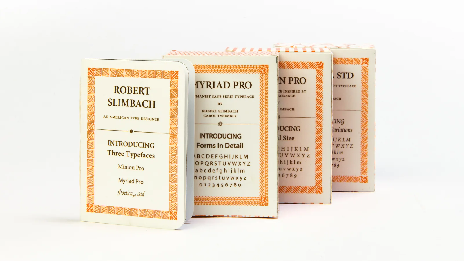
A series of mini type specimens created for Robert Slimbach by a graphic designer. Photo: Lulululululu1994 / Wikimedia Commons, CC BY-SA 4.0
If you have read a printed book, a PDF or a corporate report in the past three decades, there is a fair chance you have read Robert Slimbach’s work without knowing his name. Slimbach, who has worked for Adobe since 1987 and serves as its principal type designer, was born in Evanston.
The Evanston link is real but brief. Slimbach was born in the city in 1956 and moved to Southern California soon afterward. That is where his career took shape.
From athletics to letterforms
Slimbach attended UCLA on a sports scholarship. While running a small screen-printing shop that produced posters and greeting cards, he grew interested in graphic design and typefaces. From 1983 to 1985 he worked as a type designer at Autologic in Newbury Park, California, where he also trained as a calligrapher. He then freelanced for roughly two years, drawing ITC Slimbach and ITC Giovanni for the International Typeface Corporation. He has said he was not making enough money to live on.
That changed when he joined Adobe Systems in 1987.
The Adobe catalog
Much of his Adobe work revisits classical models. The early list includes Utopia (about 1988 to 1989), Adobe Garamond (1989), Minion (1990) and Poetica (1992). Later came Brioso, drawn from his own calligraphy, in 2003, then Garamond Premier Pro, Arno in 2007, Acumin in 2015 and Pelago in 2017. He also designed Adobe Clean Sans and Adobe Clean Serif for the company’s branding and interfaces, and Adobe Hand B, based on his handwriting.
Minion, released in 1990, and Adobe Garamond, from 1989, are among the earliest of the Adobe designs.
A craft that became software
Type design is slow work. A designer draws every letter, number and punctuation mark, then adjusts how they sit beside one another. Slimbach’s calligraphy training matters here, because the pen shapes the stroke contrast and rhythm of a face before any software touches it.
The software side has grown steadily. 1990s designs typically held 200 to 500 glyphs, while his typefaces since about 2000 usually carry 1,500 to 3,000. Extra glyphs can mean ligatures, small capitals, alternate figures, accented characters for many languages and other refinements. A modern type family is less a single font than a product with a long feature list that has to behave properly inside design programs, word processors and browsers.
That dual nature is one reason Slimbach’s career is interesting for anyone who follows creative technology. The letters themselves are now data files, but the job is the same as it ever was: make text easy to read.
Recognition
Slimbach received the Prix Charles Peignot from the Association Typographique Internationale in 1991 and the Frederic W. Goudy Award in 2018. The Type Directors Club has honored his work several times, including awards for Brioso (2002), Garamond Premier Pro (2006) and Arno (2007). He is also a calligrapher and a photographer who works in black-and-white film, mainly portraits.
The sources reviewed do not describe any ongoing tie to the city. Still, a baby born in the city in 1956 went on to draw some of the most widely used letterforms in digital publishing. It is a small distinction for a town with a long list of them, and a good reason to look more closely at the next page you read.
Daniel Okafor covers business, startups and the Innovators section for The Evanston Edge.